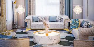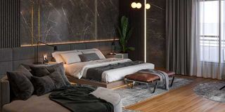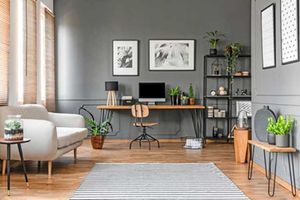
Different colours have varying ability to affect the way we feel, think, and act within a particular space.
With regard to home staging, colour psychology is a silent but powerful tool that transforms ordinary houses into emotional homes that occupants have an attachment to.
From neutral tones that create spaciousness to bold accents that evoke excitement, the strategic application of colours makes the difference between a speedy sale and a property that lingers in the market for months even years.
Faith Makokha, Interior Designer

Faith Makokha, an interior designer at Elegance Hub Kenya and Kelvin Laichena, a colour expert in architecture, share their insights with Property transformative power of colours—how they influence emotions, shape decision-making, and masterfully enhance the art of selling a home.
What is colour psychology and its relevance to interior design?
This is how colours influence emotions and behaviour. In interior design, it helps set the mood and enhance functionality. Cool tones like blue and green promote calmness, while warm tones like yellow boost energy. Light colours make spaces feel larger, and dark tones create intimacy. Choosing the right colours aligns a room's purpose—blue for calm bedrooms, yellow for energetic kitchens, and green for balanced living rooms. Understanding colour psychology allows for designs that evoke the desired emotions and functionality.
How do neutral colours compare to bold or vibrant colours when staging homes?
When staging homes, I find that neutral colours create a calm, inviting atmosphere that appeals to a wide range of buyers. They serve as a versatile backdrop, making it easier for potential buyers to imagine their own style in the space. Bold or vibrant colours, while eye-catching and full of personality, can sometimes alienate buyers with different tastes or distract from the home’s features. From my experience, neutral tones tend to sell homes faster and often for higher prices because they create a universally appealing and adaptable environment.
How do colours affect emotions and decision-making in prospective buyers?
Colours can strongly influence emotions and decisions. Neutral tones like beige, gray, and white create calmness and make spaces feel clean and inviting. They also make rooms appear larger and more open.
Bold colours like red or orange bring energy and excitement, but can feel overwhelming if overused. On the other hand, cool colours like blue and green promote calmness and trust, helping buyers feel at ease. Choosing the right colours is key to creating an emotional connection and guiding buyers’ decisions.
Can you share examples of how certain colours have positively or negatively influenced a buyer's reaction to a home?
I’ve seen how colours can make or break a buyer’s perception of a home. For example, soft neutrals like light gray, beige, or white are calming and universally appealing, helping buyers imagine their style in the space. These tones often lead to quicker sales and higher offers because they feel clean, spacious, and welcoming. On the flip side, bold colours like bright red or deep purple can overwhelm buyers, making them uneasy or distracted. While red can evoke passion, too much feels aggressive. Light blues or soft greens in bedrooms, however, create a sense of relaxation, helping buyers connect emotionally with the home.

Are there current trends in home staging that incorporate colour psychology?
In home staging, I’ve noticed that colour psychology plays a big role in current trends. Neutral tones like soft grays, off-whites, and beiges are still popular because they create a sense of calmness, cleanliness, and spaciousness. I also see accent colours being used strategically—light blues and greens in bedrooms to promote relaxation, and warm earthy tones like terracotta or mustard in living areas to make them feel cozy and inviting. Subtle pops of vibrant colours, like mustard yellow or navy blue, add just enough energy and personality without overpowering the space.
How do cultural or religious preferences influence the choice of colours?
Over the years, I have learned that cultural and religious preferences can influence colour choices in home staging. For example, in many Western cultures, white symbolises purity and cleanliness, making it a go-to choice, but in some Eastern cultures, white is linked to mourning, and colours like red or gold are preferred for their association with luck and happiness. Red might be seen as lucky in some cultures but too bold in others. Similarly, blue can represent tranquility in the West but sadness elsewhere. Religion also matters—Hinduism favours yellow and saffron as auspicious, while Christianity might use purple in reflective spaces. Keeping these nuances in mind helps create a home that feels more inclusive and appealing.
Are there common mistakes people make when selecting colours for staging homes, and how can they be avoided?
I’ve seen some common mistakes when it comes to choosing colours for home staging. Bold colours can overwhelm, dark tones in small rooms making them feel cramped, and too many contrasts can create a chaotic vibe. To avoid this, I stick to neutrals for walls—they keep things clean and spacious. I use accent colours sparingly to add personality without overpowering. For smaller rooms, I go with light, soft hues to make them feel open. I also ensure a harmonious flow of colours throughout the home to keep it balanced and welcoming.
Can you share a specific project where the use of colour psychology made a difference in selling a property?
I once worked on a home staging project in a suburban neighbourhood where the property had been on the market for months without serious offers. The outdated interior lacked appeal, so we used colour psychology to refresh the space. We chose soft, neutral tones like light gray for the walls and beige for furniture to create a clean, spacious feel. In the bedrooms, soft blue accents promoted tranquility, while green throw pillows in the living room added calm and harmony. Light yellow accents in the kitchen brought warmth and energy. The transformation made the home feel inviting and emotionally appealing. Within weeks, it received multiple offers and sold above the asking price—proof of the power of thoughtful colour choices!
What are the most effective colours for creating a welcoming and appealing atmosphere in a staged home?
The best colours for creating a welcoming atmosphere in a staged home are soft neutrals like beige, light gray, and warm whites. They make spaces feel clean, open, and adaptable. Soft blues and greens add a calming, relaxing vibe, while accents of soft yellows or earthy tones bring warmth and coziness. These choices highlight the home’s features without overwhelming, making it feel universally inviting.
Are there specific colour palettes that work best for different rooms (e.g living room, bedroom, kitchen)?
Yes, certain colour palettes work better for specific rooms, enhancing the desired atmosphere. In the living room, soft neutrals like beige or light gray make the space warm and inviting, while muted blues or greens add a calming touch. For bedrooms, soothing colours like soft blues, lavender, or light gray help promote relaxation. In kitchens, fresh tones like white, pale yellow, or soft green keep things clean and airy. Bathrooms feel fresh and spa-like with light blues, soft greens, or whites. These choices set the right tone for each room and appeal to buyers.

Kelvin Laichena, a colour expert in architecture, shares the significance of various colours, their meanings, and the best contexts for their application.
Kelvin Laichena
Red
Red is such a powerful and intense colour, full of energy and passion! I love how it evokes excitement and encourages social interaction. For example, it’s great for restaurants like McDonald’s or KFC, as it stimulates hunger and quick decisions. In gyms or sports venues, red energises the atmosphere perfectly. I’d also use it sparingly on an accent wall in a living room to add warmth and drama. However, I always approach red with caution because it can feel overwhelming or even trigger anxiety if overused. Keeping it as an accent ensures it enhances the space without dominating it.
Yellow
This is a cheerful, attention-grabbing colour. It’s the brightest on the spectrum and instantly lifts your mood. It's linked to happiness, creativity, and mental clarity. In kitchens and dining areas, it makes spaces feel lively and energetic, while in schools and learning spaces, it enhances concentration and memory retention. However, too much yellow, especially in bold shades, can feel overwhelming or even stressful.
Orange
Orange is a colour that is vibrant, dynamic, and full of energy. It’s like a perfect blend of red’s intensity and yellow’s cheerfulness. When used, it makes one feel warm and invited. This colour is a creativity booster and a conversation starter. It’s perfect for spaces like creative studios or kids’ play areas—it sparks innovation and excitement. Even in gyms, orange can keep the energy levels high and motivation flowing. However, one should remember that overdoing oranges can feel overpowering.
Green
Green is the colour that instinctively connects us to nature. It represents growth, health, renewal, productivity, and relaxation, making it one of the most versatile and calming colours in architecture and design. Green reduces stress and promotes relaxation, improving concentration and productivity.
It symbolises nature, health, and renewal. Green also represents connection; connection to ourselves, to the quiet moments in our lives, and to nature itself. It can be used in healthcare facilities and hospitals to promote healing and reduce anxiety. On the other hand, when used in offices and workspaces, green can enhance focus and reduce eye strain. In hotels and spas, it creates a relaxing, luxurious environment. However, overuse of dark green can make a space feel heavy and overly serious.
Blue
Blue is cool, calm, and reliable. It’s the colour of trust and serenity, and it works wonders in creating peaceful and focused spaces. Blue is perfect for bedrooms and bathrooms, where light shades create a tranquil vibe. In offices or meeting rooms, it boosts productivity and reduces stress, which is why corporate spaces love it. Even healthcare facilities use blue to instill trust and comfort. However, it should be noted that too much dark blue can feel chilly.
Purple
Purple is such a fascinating colour—it’s like the best of both worlds, blending blue’s calmness with red’s energy. It's royal and creative, it feels luxurious yet introspective at the same time. I love seeing deep purples in luxury hotels or boutiques—it adds a sense of exclusivity. And for creative spaces or art studios, purple inspires imagination and expression. In bedrooms, soft lavender is a game-changer for relaxation and sleep.
White
White is a symbol of purity and openness. It makes a space feel larger and brighter. It also creates a clean, uncluttered vibe, perfect for modern minimalist designs. It’s ideal for hospitals and clinics, reinforcing a sense of hygiene. In galleries and museums, white provides a neutral backdrop that lets the artwork shine. And for minimalist interiors, it’s a blank canvas that amplifies natural light. But too much white can feel sterile.
Black
Black is a colour that is bold, elegant, and full of depth. When used in interiors, it instantly feels high-end and dramatic. It’s stunning in luxury interiors or high-end spaces, creating a sense of prestige. Accent walls and furniture in black add a modern, striking touch, and in theatres or cinemas, it helps you focus entirely on the screen. However, black can feel heavy if overused. I’d balance it with plenty of natural light, metallic accents, or contrasting textures to keep the space refined yet inviting.
All said and done, Kelvin says colour is more than just decoration; it shapes emotions, influences behaviour, and defines the function of a space.
By understanding the psychology behind each colour, one can craft environments that enhance well-being, productivity, and comfort.


